Have you ever stared at the airport’s arrival/departure flipping board for so long, that you feel like you’ve been transported to another world? Or maybe stand in awe of seeing so many different walks of life congregated in just one place? That’s maybe two of the many beautiful effects you’d get by being in the airport.
W3-O has always been intrigued not only by the effects that airports have on people but also its modern architecture. Of course, our very own Singapore Changi Airport Terminal 3 (T3) is one of them. This then led us to pitch for revamping the immigration checkpoint glass panels at T3.
The inside story
T3 was designed and conceptualised by CPG Corporation and Skidmore, Ownings and Merrill LP. The unique aspects of T3 includes the visible “Butterfly Roof”, the 5 stories high Green Wall and open concept that makes use of transparent glass panels all over.
Upon taking up this pitch, we knew it wasn’t going to be an easy match as we were going head-on with the big boys. But gloved with our “fight club” spirit, we boxed our way through.
The glass mural that we were supposed to design needed to “block out” the public’s view for the immigration checkpoint.
The process
As much as we wanted to go crazy and come up with something out of this universe, we had to keep in line with the architecture concept.
Taking the openness and floral concept of T3 into consideration, we juggled around with several ideas. As the glass panels were relatively huge, we needed to work on high resolution and large working file to ensure the images won’t be pixelated.
1. We first created the base graphic of floral design that is consistent with the eco-appeal of T3.
2. Next, bringing our creativity forward, we added some artistic elements that will soften the edges, to complement the contemporary and modern structure.
3. Finally, to carry through with the open concept of T3, we proposed printing on frosted and translucent sticker so it will not lose the openness appeal.
The end result
Because we don’t believe in the impossible, we’d go the extra mile for you. Our understanding of deliverables, medium and architecture won us the fight against the big boys.
Come knock on our doors with your bricks and concrete, and we’ll build you more than a mural!
W3-O Design Lab can do consumer electronics in its sleep. But what about something that’s entirely on a different spectrum. The agency tried and won its first ever integrated marketing campaign pitch against eight other agencies. How? We stepped out of our comfort zone.
The objective of the campaign is to promote messages to the foreign workers on safety laws, responsibilities, and regulations in the workplace. The agency looked into the past campaigns and garnered feedback from the target audience. The (realization) is that the current and past ads didn’t seem to speak to the target audience. Yes, the messages are clear, the consequences are quite direct. But do they understand the entirety of these laws, rules, and regulations. There was something lacking in the campaign ads and that’s where W3-O tapped in and concentrated its efforts. There are 3 things:
1. Using conversational copy and simple visual to represent the rule or regulation
2. No need to explicitly show consequences
3. Call to action needs to be direct and clearly seen
Here were the proposed layouts the agency initially submitted that eventually won us the pitch:
The final artwork turned out like these:
It was also the agency’s first time to dabble on media strategy planning. They key insight was looking into mediums that haven’t been tapped on and make it work to our advantage. One of the mediums was the use of Prepaid Phone Cards. Most foreign workers oftentimes call home constantly to get in touch with their loved ones. Other than the basic necessities such as food and clothing, the phone cards become essential to their everyday use. Bingo! A medium with almost a hundred percent exposure – and with an interesting design, these cards will even be kept in their wallets as long as possible. In partnership with the calling card company, IDT Asia, the agency proposed a voice recording of the MOM messages for the campaign period. Once the foreign workers activate the cards, they will be hearing the message in the language they have chosen (English, Tamil, Bengali, Thai, & Chinese). To ensure that the foreign workers will get the opportunity to get all three messages (3 cards), the agency crafted a collection mechanism. The 3 cards will roll out in different timings to get longer exposure time. IDT Asia will blast out SMS to the current database to remind foreign workers when a certain card is coming out. All 3 cards must be collected to enable them to redeem a free T-shirt towards the end of the campaign. These T-shirts then served as walking advertisements for MOM.
Other mediums used were MRT Ads at Little India and Chinatown Station – 2 key MRT stations that targets Indian and Chinese target market, 6-sheet Bus Ads and Bus Shelter Ads across Singapore. The introduction of a new platform – use of private buses that ferry foreign workers to their workplaces and dorms came out as the 3rd highest is terms of ad recall (1st: Bus Ads, 2nd: MRT Ads). All of these comprised the media proposal.
Overall, the clients found the campaign a relative success comparing to last year. There was a considerable increase in ad recall, as well as more people have used the MOM hotline. For W3-O Design Lab, it was an experience that placed us on the map of Singapore.
KDK, together with its partner Dian Niaga and W3-O Design Lab Singapore, has successfully helped to rebrand and repackage its line of local spices for the Yogyakarta community for sale in the commercial market – bringing a new hope to the people of Yogyakarta.
In 2006, a devastating earthquake rocked a village in Yogyakarta leaving it in ruins. Kerabat Desa Kota (KDK), an NGO based in Yogyakarta, immediately got on the scene to help rebuild the communities that were most affected. Instead of merely giving aid, one of KDK’s main focuses was on life sustainability – KDK wanted to make sure that the people can continue to rebuild their life even after they leave – by teaching them how to earn money.
2006 Earthquake in Yogyakarta
Farming is one of the main sources of income for the people of Yogyakarta, but there’s just one problem – they’re not utilising all of their harvest. Instead, they are letting excessive harvest go to waste or selling them at super low prices
Using the Sun-Drier (Glass House) method that KDK taught them, the people at Yogyakarta was able to convert excess harvest into dry goods which could be sold at more competitive rates. There was, however, one more problem that they faced. They had trouble naming and branding their goods. Without a proper name and brand, they couldn’t sell their goods at a price that was sustainable to them.
Sundrier
Dried chili
Dian Niaga, a partner of KDK, came to know of this problem and consulted The Humanity Forum (THF) with regards to making the products more appealing and marketable. THF had previously worked with Dian Niaga and JMHI, and successfully rebranded and marketed Dorsata. THF then invited W3-O Design Lab Singapore (who had previously supported JMHI on the rebranding of Dorsata) to come on-board this project. W3-O Design Lab Singapore, knowing that they could help the people of Yogyakarta, immediately agreed to help and support this project on a pro-bono basis as part of their CSR program.
With the support of THF and W3-O Design Lab Singapore, a brand new packaging was revealed. The packaging was not only attractive, it also managed to educate consumers about the history of Yogyakarta with its interesting visuals.
There were altogether 10 different packaging that were successfully developed. These 10 different packagings were for: Red Chilli, Ginger, Turmeric, Coriander, White Pepper, Bird’s Eye Chilli, Cinnamon, Clove, Black Pepper, and Nutmeg.
Most NGOs are good at what they do, but as illustrated in this example, there are some tasks (such as marketing and branding) that are best left to the professionals. This is another example of “humanitarian branding”, and THF hopes that more NGOs will engage the help of professionals when the tasks exceed their area of expertise.
Before
After
THF would like to take the opportunity to thank W3-O Design Lab Singapore in lending their help and support for this project. THF would also like to wish Dian Niaga, KDK, and the Yogyakarta community all the best in whatever they do.
Photographs are courtesy of TEAM 9, KDK & W3-O Design Lab
“Tis the season to be jolly, Fa la la la la, la la la la.”
The end of the year is usually filled with love and surprises, and here in W3-O, we’ve always indulged in festive seasons.
We know how many Christmas greeting cards you receive each year and we didn’t want to be part of the pile that gets lost. We wanted it to be something innovatively fun with a tasteful treat for your eyes.
So this year we decided to go a little soft and mushy in the head, working merrily together with Mr Santa Claus himself, to create our very own “woody pulp” Elf and Rudolf!
Be good now, and we might drop you some pulpy mushiness for the coming Christmas.
Both “woody pulp” Elf and Rudolf fit perfectly into an A5 envelope.
W3-O Design Lab is proud to have been chosen to partner Majlis Ugama Islam Singapura (MUIS) in launching the new Halal Certificates for eateries nationwide. These revamped designs boast a modern, contemporary look and also an Islamic pattern at the bottom. All in, a total of 10 certificates for the 10 different schemes have been designed.
See these new certificates for yourself at all Halal-certified eating establishments throughout the island!
Congratulation MUIS!
The launch of The New MUIS Halal Certificates with Guest-of-Honor Dr. Yacoob Ibrahim.
In 2009, W3-O Design Lab and Exploit Technologies, a division of the Agency for Science, Technology and Research (A*Star), collaborated on a revolutionary gesture-based game called “Shooting My Friend”.
This highly-interactive game allows the player to play using just hand movements, without any handheld controller. The game’s launch was to showcase this new technology in Singapore, that was a precursor to the Microsoft Kinect.
The premise of the game was to “shoot” stones from a virtual slingshot at moving images of your friends. This simple yet addictive game debuted at a private event in December 2009 and garnered a good response from the crowd.
Although Exploit Technologies had the hardware for the game, it lacked a strong showcase or marketing efforts to make it work. Furthermore, their previous samples were cumbersome and didn’t push the 3-axis boundary. With the help from W3-O, the game went through several rounds of revisions before it was eventually unveiled in a scant 3.5 weeks. The new version also had to work with the Microsoft Natal, a proprietary stereoscopic camera with Infrared that captures the span and depth of the hand gestures and replicates it on the system like a computer mouse. The challenges were huge but the outcome made them all worth it.
We are indeed privileged to have worked with Exploit Technologies and we will continue to explore new options together.
From a humble beginning, Borneo forest honey harvested by the local tribesmen in Borneo and other parts of Indonesia has been transformed into a product with an international positioning. This success story of humanitarian branding is achieved through a close collaboration between 2 NGOs a social enterprise.
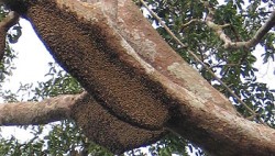
The Bee Hives on a tall tree (10-30 meters tall)
The Indigenous People
The Beginning
Mr. Johnny Utama, the managing director of a social enterprise Dian Niaga Jakarta (DNJ) is one of a veteran in Indonesia’s NGO/humanitarian scenes. He’s been involved in a lot of conservation and humanitarian efforts there. One of his latest projects at that time was to consolidate all forest honey harvesters in Indonesia into a network called “Jaringan Madu Hutan Indonesia” (JMHI, Forest Honey Network of Indonesia). Most of the members are the indigenous people who live inside the thick jungles of Borneo, Sumatra, Sumbawa, Sulawesi, and many other parts of Indonesia. Since getting recognition from outside this network is one of their missions, JMHI needs an identity. Therefore, Mr. Johnny decided to consult this matter to his friend who is a professional producer in one of the largest advertising agency in Indonesia, Cynthia A. Sudarto, who is also our director for Indonesia. At the same, Mr. Johnny presented his idea of launching a high-end organic forest honey. After their informal chat, Cynthia shared this matter with me and we agreed to work on this project.
One of the main reasons why THF decided to take on the project is because of the fact that, the NGO and the products are aimed to improve the lives of the harvesters who are the indigenous people lives in the thick jungle of Borneo, Sumatra, Sulawesi, Sumbawa and other parts of Indonesia. We believe that we can help them in the marketing aspect, which in turn, can help in boosting their sales. This means, the tribesmen will get more benefits through modern marketing.
Forest Honey’s Old Label
Iyak Mus, the Harvester with the Old Label
Since this project has a very little budget unlike commercial ones, we were challenged to find a branding agency that can take on this project. Furthermore, getting good recognition with the high positioning of their new products are their main objectives, we were challenged even more as in normal cases, to execute this kind of brief will require quite a number of branding specialists like branding manager, creative director, art director, graphic designer, copywriter, photographer, etc. We all know, more experts, more manpower, equals high budget. However, through our networks, we managed to get a branding agency that is willing to work on this project on a “pro-bono” basis. W3-O Design Lab, a small brand boutique based in Singapore that handles quite a number of regional accounts, was very excited to be able to participate in this project. They even offered to cover the whole branding activity, which will be further explained in the next paragraph.
With their extensive experience in regional branding activities, particularly in South East Asia, Asia Pacific as well as global markets, W3-O Design lab has come up with a total branding solution for the high-end forest honey. Here are the steps:
1. Finding the right name
Naming is one of the most important aspects of branding. Having a wrong one might put your brand into a wrong position or sometimes it might even jeopardise it. Initially, the brief stated to use “Madu Hutan” (“Forest Honey” in Indonesian) as their name. However the agency (W3-O Design Lab) found it rather ineffective and understated. Considering the new product will be positioned internationally and among high-end products, we needed something that has more “weight”. Honey, or forest honey in particular, is not something new. People has been consuming it for thousand of years. And the fact that we are aiming for higher positioning, we can be assured that our target audience is familiar enough with honey product. So, if we were going to call it “Madu Hutan” or “Forest Honey”, the audience will think that this might just be any other ordinary low-mid quality honey harvested from the forest. It is understated indeed, as our honey has much higher quality and organic certification. Therefore, we needed something that will appeal to the upper-class. After several proposals, Dorsata – Organic Forest Honey, was then selected. It is derived from the scientific name of the giant forest bees –Apis Dorsata, that collect nectars from forest flowers which then produces the forest honey, our product. Just like the Manuka Honey from New Zealand, “Dorsata Honey” will also be displayed on the same shelves.
Dorsata new logo
2. Label Design
The next step is to come up with the labels of the products. Due to the limitation of production technicality, the agency could only work with simple labels for the jars. However, this has become a challenge by itself for the agency, as there were quite a number of unique selling points (USP) that could be applied into the packaging. One of the most unique ones is the harvesting technique, which has been ingeniously narrated in a simple graphical yet stylish on the bottom of the label. The label designs were very well received among JMHI members, commercial sectors as well international audience.
Dorsata Brand New Label
Product Display During the Launch
That’s All?
After coming up with the correct identity and packaging, we can say that we are quite ready to hit the production line but not the shelf. The agency suggested a few collaterals and advertisements to boost the branding and the marketing activities. These were very crucial items for the on-going marketing campaign particularly for the launch and roadshows.
JMHI’s New Logo
Dorsata T-Shirts
X-Stand Banner
Flyers
The Launch of Dorsata in Jakarta
After all the preparations, Dian Niaga Jakarta decided to launch The Dorsata in a rather unique venue in the southern Jakarta, the QB bookshop’s café. The whole café was decorated with leaves and giant Apis Dorsata on the ceiling. According to Mr. Johnny, he wanted to let the whole audience have a feel of the thick tropical rainforest where the indigenous people harvest the honey. This was elaborated further by the appearance of one of the harvesters from Borneo in Ibanese traditional clothing, to sing the “Timang Lalau”. It is a song or a mantra that needs to be sung during the harvest. It is such an amazing tradition that should be preserved. Besides the “Timang Lalau”, there were quite a number of speakers from other NGOs presenting their involvement in Dorsata and JMHI, including The Humanity Forum. Most of the attendees are from the environmental NGOs/researches, Press and some private sectors. Everybody seems to be very impressed with the Dorsata as it appears to be very professional and highly marketable. This was proven as one of the attendees from private sectors approached Mr. Johnny to talk some business deals. It was a great and fruitful event for DNJ. As for us, The Humanity Forum, we were also approached by quite a number of NGOs and researchers who were very interested in finding out more information about our MEDIA NGO. In fact, some of them showed some interest in working with us.
The forest and the Apis dorsata in Jakarta
The Timang Lalau by pak Abdullah
Mr. Johnny with Mr. Jenne of NTFP
Presentation by The Humanity Forum
Post Launch
It’s been more than half a year since the launch of the Dorsata, but we still get regular text SMS-es from Mr. Johnny about how well the Dorsata has been received during their on-going roadshows/seminars locally and overseas. Below are just some of them:
“…The Ibanese honey hunter told me: ‘It is like a dream my honey became so nice’ He said ‘the first time I notice it is Danau Sentarum Honey’ Dress up” in this beautiful bottle my tear almost drop’…”
“ Will, we just returned [from] India after [attending] honey workshop. I [presented] DORSATA [to] everybody [and they all] said [that] DORSATA is the most beautiful design . U should be proud of it. [The] Indonesia team [is] also very proud…”
Dorsata Honey in India
Ibanese Tribeman
Dorsata, A Success Story for Humanity
As u can see, there is a better to market a product. Due to limited resources, a lot of products from NGOs or even social enterprises appear to be very amateur and sub-standard despite their good quality product. We all know that buying behaviour has changed where the buying experience is equally important. Dorsata Organic Forest Honey has shown us all that with some help from the professionals (branding and media), NGOs and social enterprises are able to compete with the private sectors. With its networks, The Humanity Forum, the media NGO, will be able to assist other NGOs to achieve it.
*Pictures are courtesy of Wahyu Widhi and Willy Tanujoyo


")


 Dorsata Brand New Label


 Dorsata Honey in India
 Ibanese Tribeman