w3-o
Loading
beyond the studio // January 17, 2012

A Water Tank that Communicates.

The Beginning

W3-O Design Lab is no stranger to The Humanity Forum (THF) and Team9, having been a loyal supporter of both for several years and counting. The reason simply being that Team9-THF carefully analyses who and what they support, before deciding to take on the project. More importantly, they get things done effectively and efficiently.

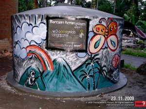
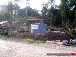
So, what got us started on this new quest with Team9-THF, was the inspiration gained from Trauma Healing Programme in Pariaman, after the 2009 Padang-Pariaman Earthquake where both teams painted some illustrations on the Tangki Ferro Cement (TFC – which means Ferrocement Water Tank in English), as a form of art therapy for post-trauma syndrome. From a designer’s and media specialist’s perspective, we saw an opportunity to create something more than just a water tank – a communication platform – for their Mentawai Rebuilding Campaign.
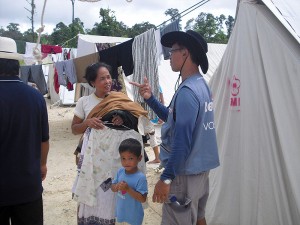
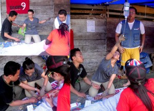
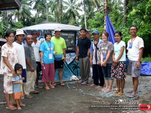
Team9 with IDPs in Mentawai

Team9’s Humanitarian Mission to Mentawai in November 2010


Team9 in Pariaman

One of the TFCs built by Team9, during their rebuilding programme in Pariaman, West Sumatra 2009

The Concept

We proposed the idea to Team9-THF, and they were delighted with it as this would help in the extension of their hygiene programme for the Internally Displaced Persons (IDPs), who lacked public and hygiene utilities in Mentawai.

We wasted no time and launched the project in high gear. After much research and discussion with Team9 was thrown out on the table, we decided to focus on these two key aspects:

1. TFC

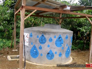
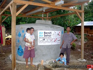
As the Mentawai people collect water for their daily usage from the river, they wouldn’t know or understand the purpose of having a water tank or clean water for that matter. So, we needed to formulate a message that conveys the purpose and proper maintenance of the water tank. However, high-level of illiteracy in Mentawai was a challenge to us as we had to convey the right message to them. On top of that, we needed to allocate some space for the donor and Team9’s logo, and ID number for tracking. With all these in mind, we concluded to execute our message using iconography with simple vector illustration.
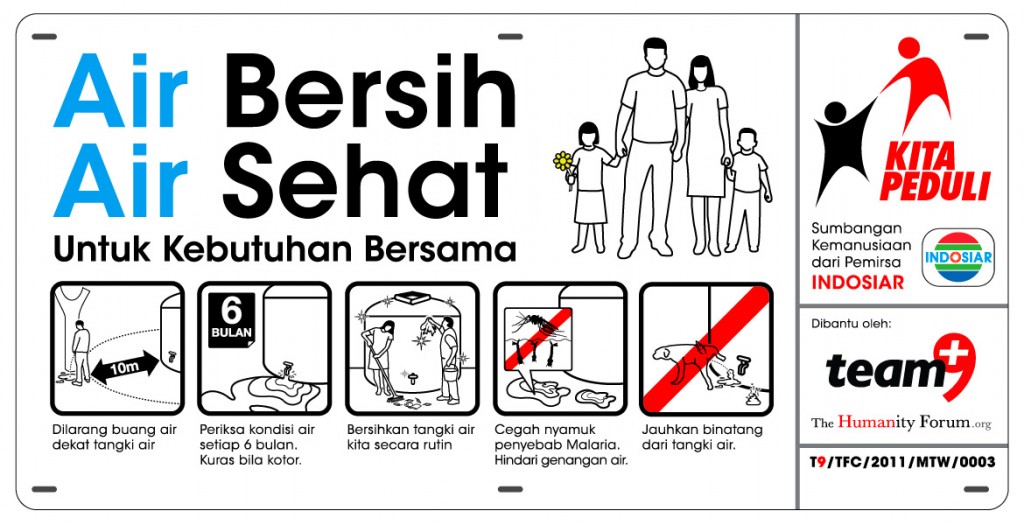
Translation:

  • Air Bersih, Air Sehat = Clean Water, Healthy Water
  • Untuk Kebutuhan Bersama = For Communal Needs
  • Dilarang Buang Air Dekat Tangki Air = Do not urinate near water tank
  • Periksa kondisi air setiap 6 bulan. Kuras bila kotor = Check water condition every 6 months. Drain it out if it’s dirty
  • Bersihkan tangki air kita secara rutin = Clean our water tank regularly
  • Cegah nyamuk Malaria. Hindari genangan air = Prevent Malaria Mosquitos. Avoid water puddles.
  • Jauhkan binatang dari tangki air =  Put animals away from water tank
  • Sumbangan kemanusiaan dari permirsa INDOSIAR = Humanitarian donation from the viewers of Indosiar TV channel.
  • Dibantu oleh = Supported by

2. Hygiene Campaign

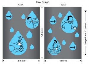
Since Mentawai people are not well-versed in their hygiene practices, we decided to extend Team9’s hygiene programme by educating the locals on the usage and maintenance of these water tanks. So instead of listing down a step-by-step guide of how-tos, our design expertise led us to create iconography of different scenarios where locals can use the clean water for their daily lives – from bathing to cooking and drinking.
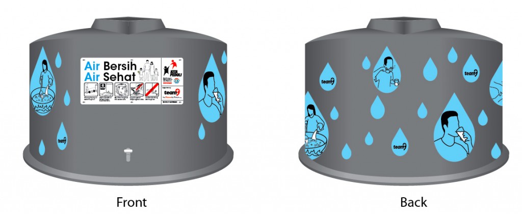
The concept

Is that all? Certainly not!

If you think all the above mentioned were mind bogglingly tough, the best challenge had yet to come! Sparking off ideas like fireworks is easy, but carrying it out is where the hair-pulling and table-banging starts. Besides executing, W3-O also had to mull over the production of our materials. We definitely could not produce the artwork in Singapore and transport it over to Mentawai, due to cost limitations and accessibility. Also, producing the artwork in Mentawai is a no-go as they lack electricity and printing equipment. But with W3-O’s expertise in maximising cost efficiency and know-how, we proposed to print weatherproof metal plates and create stencils in Jakarta, before the team sets off, and paint the illustrations in Mentawai.

Additionally, we’re quite fortunate to have a partner in Jakarta (another supporter of Team9) Matari Advertising, one of the biggest advertising agencies in Indonesia, to lend their support in production. From here, we came up with a simple cost efficient solution together – two heads are always better than one.
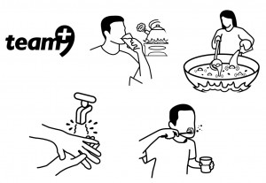
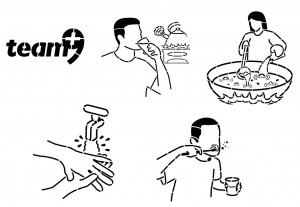
Original illustration

The original vector illustrations converted into stencil-friendly illustrations

As the printable area of the water tank is about 7m x 1.6m and there is no “rigging” solution in the middle of Mentawai jungle, we decided to slice up the illustrations into 2 main pieces. This would save Team9 the hassle of finding additional workers just for this job.

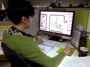
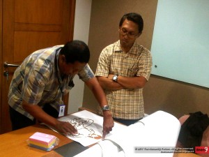
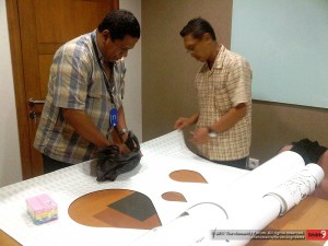
Crafting all the illustrations at W3-O Design Lab Singapore

Carefully going through the stencils

The bag of sponges was used to “brush” or “spot” paint on the stencils

Design Improves Life


Design is not just about creating a pretty picture, it’s about improving lives. “Form follows Function” is the key to bridge the gap between aesthetics and benefits. If the end product only looks nice but does not bring about any user benefits, it will get mooted out eventually. Just imagine an obscurely designed chair that is only for the eyes to see, but not for the body to experience. With this, W3-O went all the way back to the fundamentals, which is to fully understand our audience and the environment where our designs are to be placed.

After executing the iconography and simple illustrations, we needed to create stencil lines to be cut out. It may seem like an easy task to simply draw lines on the visual, but it’s definitely more than meets the eye. We drew the lines such that it looks like part of the design, without distorting the visuals, turning technical challenges into an aesthetic appeal.

So, by creating an aesthetically enticing visual with an end in mind to understand the whole communication objective and medium, we will be able to stretch design beyond its capabilities – improving the lives of Mentawai people to stay healthy and curb the spread of intestinal diseases among kids.

All in all, W3-O is proud to lend our creative expertise and resources to Team9-THF in their 3-year plan of Rebuilding Mentawai.

May the Force be with Team9-THF and the people of Mentawai.
beyond the studio // June 2, 2010

A difference made for these little people with big dreams.

It all started with a vision…

“Our vision for every child, life in all its fullness;
Our prayer for every heart, the will to make it so.”

Every child is entitled to dream, whether big or small, and World Vision Singapore is there to help fulfil the dreams of the less fortunate children from over 100 different countries.

The story goes…

Some time back in June 2010, W3-O received a call from World Vision Singapore, who was keen in getting help to revamp their current collaterals. They were pleased with the previous CSR projects that we’ve done for other NGOs, and wanted an agency that is not only passionate about giving back to society but also understand the works of charity organisations.

We were tasked to conceptualise a Marketing Kit, comprising of various collaterals that would provide information and convey their vision to corporate entities, individuals and youths.

It was a rather challenging project with the strict Corporate Identity (CI) guidelines we had to adhere to. Budget was another hurdle we had to cross, as World Vision Singapore would rather pump more resources to their beneficiaries than on marketing efforts.

However, geared with our “never say die” attitude and creative expertise, we accelerated head-on to maximise whatever resources given to us. At the same time, ensuring the collaterals makes an emotional connection to the people in Singapore.

Overall packaging – Brochure folder

In most instances, what we see/know and the reality are worlds apart. Also, it’s hard to imagine not having proper living conditions in our clean and green Singapore, with high-rise apartments and sky scrapers all over.

After our many brainstorming sessions, the main direction we wanted to head towards is to portray an emotion that reaches out to pull the heart strings of the public, and also to create awareness as to what’s happening around us.

Very much like the “Before & After” concept, we came up with a 2-tier messaging of “What you are expecting” and “What you didn’t expect”.

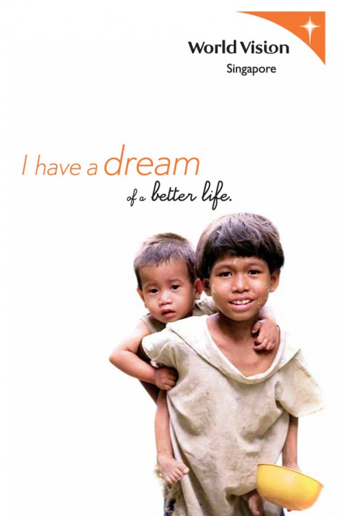
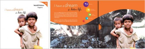
“What you are expecting”

Brochure folder - Cover
Brochure folder – Cover

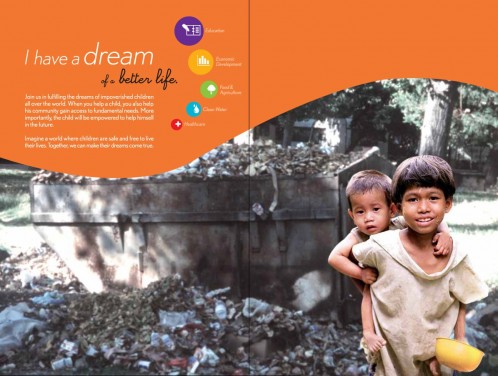
“What you didn’t expect”

Brochure folder - Inside
Brochure folder – Inside

Once the target audience opens the folder, they would see the children on the cover actually living in the dumpster.

In this day and age, it’s only normal or rather human that we only see what’s on the surface. Simply because we’re fortunate enough to have proper living conditions. The folder will be the glue that holds all other collaterals together. So with this mechanic at play, the target audience would realise the dire situation these kids are facing every day, be drawn emotionally by the visuals and hopefully to act on their emotions.

Brochures concept

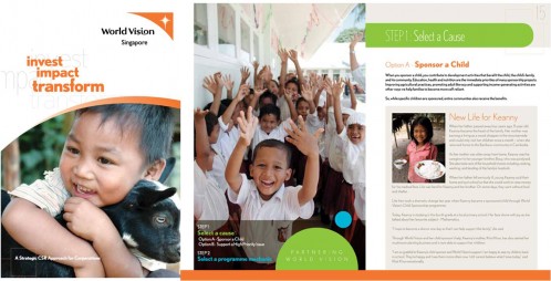
We needed to conceptualise 3 different sets of brochure – corporate, individual and youth. The tone and mood to portray for each is vastly different, adding on the fact that we had to comply with not only the CI guidelines but also the information given.

The concept for corporate entities had to look clean and more serious as they needed as much information as possible.

Corporate Brochure – Cover / Corporate Brochure – Inside

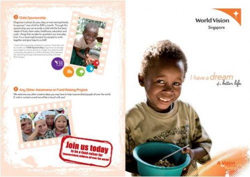
As for the individual brochure’s layout, it is less complicated as they don’t require that extensive amount of information.

World Vision Brochure

Individual Brochure – Cover / Individual Brochure – Inside

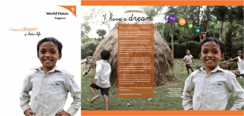
And saving the best for last, our biggest challenge yet – how could we appeal to the youths yet at the same time keep in line with the CI guidelines? Youths would definitely not be interested and engaged if we use the same design and layout as the above two.

So tapping into our youthful hearts, we made it exciting, fun and easy to read by using more pictures to bring the message across.

World Vision Brochure

Youth Brochure

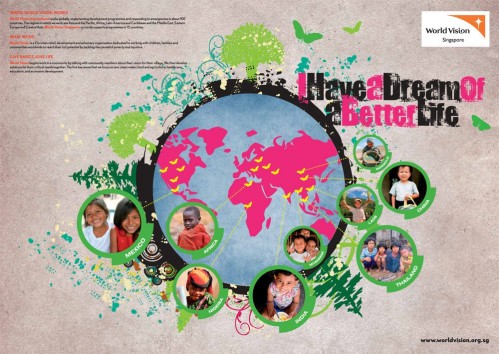
We also added an extra feature that helps maximise cost-effectiveness. We made it such that the brochure could double up as a poster on the flipside! Schools will then be able to put it up on their notice boards, or youths themselves can paste it on their walls.

Pull-Out Posters (Inside Brochure)

Poster on brochure’s flipside

Additional items

World Vision Singapore hopes that the donors support/sponsor the children in reaching their dream, and not just a “drop & go” affair. Because ultimately, it’s about the bigger picture of how we can sustain the growth and development of the less fortunate.

With their extensive journey of sponsoring a child, W3-O took a step further and transformed their current poster into an interactive and engaging “board game”. The target audience would not only have a clearer picture, but a fun time on the journey that they will be embarking on with their sponsored child.

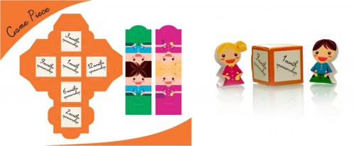
So how does this game work? Simple! It comes with the main board piece and attached game pieces of a dice and characters.

Milestones into educational game

“Fulfilling a Dream with World Vision” board game

World Vision Game Piece

Game pieces, supplied flat & after folding

  1. Roll your folded dice.
  2. Move your folded character that represents the boy or girl you are sponsoring, according to the number on the dice you’ve rolled.
  3. You’ll be able to “travel” the journey with your sponsored child, from them getting a new toothbrush, to receiving access to medical support and eventually reaching their dream.

A smile goes a long way

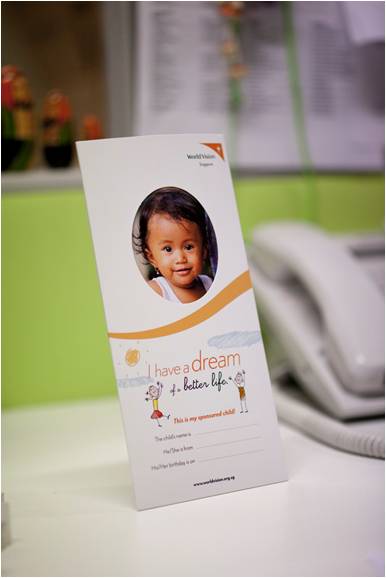
Mail-friendly photo frame

We all like to be remembered in one way or another, let alone a child who is in need of our support. What’s better than a photo frame to remember someone by? W3-O came up with a simple cost-effective photo frame where donors can proudly display the picture of their sponsored child.

Just by looking at this cute little face, doesn’t it brighten up your day already? 🙂

Just a little something extra

We also designed a CD sleeve that’s of similar design to the brochure folder. This would be used for generic purposes if interested parties who want to know more about World Vision Singapore, and how to go about doing their part for the leaders of tomorrow.

CD Sleeve

CD Sleeve

A final note

Helping our clients in maximising cost-effectiveness is one of W3-O’s driving forces to success! We believe in attainting a win-win situation, building and maintaining long-term relationships with our clients.

It’s truly a blessing to be able to pass goodness on isn’t it? Make your day better by making a difference in others. To quote the late King Of Pop, Michael Jackson’s song, “Heal the world; make it a better place; for you and for me and the entire human race”, just says it all.

Are you ready to heal the world with us?

w3-o

A partially pro-bono project – Another CSR Creative Sponsorship by W3-O Design Lab